Jisoo Park

portrait of woman

About

Projects

Resume

Design Diary 01

Stop Requested

What if riders could signal their stop when boarding?

Getting off a bus looks simple because the system is so familiar. But once I started paying attention, I realized the process quietly demands both cognitive and physical attention from the rider.

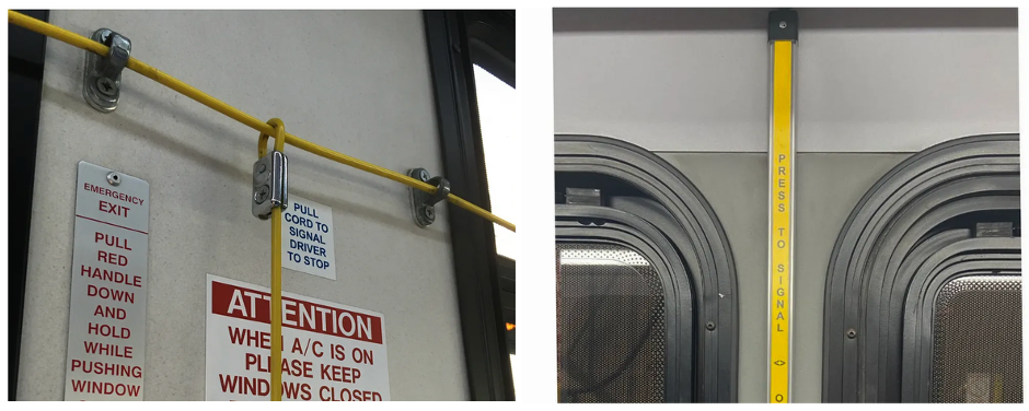
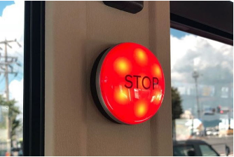
I have to notice when the bus passes the stop before mine, reach for the pull cord or press strip in time, and then confirm the signal was actually received. Sometimes that means watching for the “Stop Requested” sign, listening for the chime, or simply trusting that the driver saw it. When the bus slows down, I glance outside again to make sure it’s the right stop and quickly move toward the door before the bus starts rolling.

With repeated commutes, the sequence becomes almost automatic. But small frictions still appear. A missed stop when I get absorbed in my phone. An awkward stretch for the cord while balancing groceries. Or the subtle discomfort of signaling publicly when the bus is nearly empty.

Where friction appears

• Easy to miss the moment to signal• Pull cord sometimes hard to reach• Signaling publicly can feel uncomfortable

Design thought

What if riders could signal their destination when boarding?

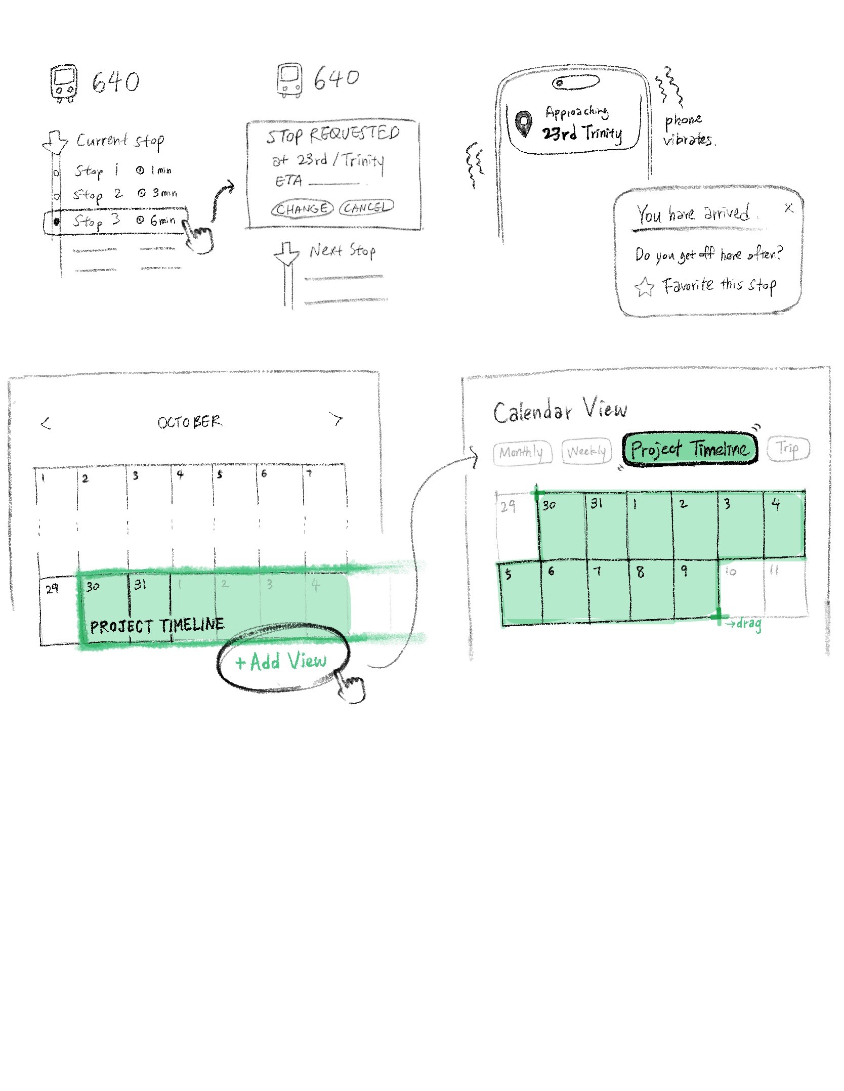
When tapping a transit card or phone, a small NFC panel could allow passengers to select their stop ahead of time. The bus system would register the request automatically, while the rider receives a subtle vibration as the stop approaches.

By adding this option to the existing system, the driver and the riders could reduce missed signals, support riders with mobility challenges, and offer a more discreet way to interact with the system.

Questions worth exploring

To develop this concept further, several design questions emerge:

• How should riders update their stop after boarding?• What mechanisms could reduce false or accidental requests?• How can the interaction remain accessible and intuitive across devices?• How should the system behave when connectivity is limited?

Design Diary 02

When Calendars Break Time

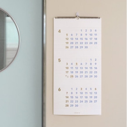
Calendars feel natural because we’ve used them our entire lives. Every month has its box of days, and every planning tool (from paper calendars to digital apps) follows the same structure. But when you actually sit down to plan something, the limitations of that structure start to appear.

Life rarely resets as the month changes.

Trips and deadlines spill over from the end of one month into the beginning of the next. Projects extend across months. Habits continue. Yet the interface forces a visual break exactly where my planning doesn’t. To see the full picture, I constantly flip between months or scroll back and forth on digital calendars.

It’s a small interaction, but over time it starts to feel like the system is organizing time for bookkeeping rather than for how people actually experience it.

Where friction appears

• Planning across months requires constant switching between views• The monthly grid interrupts the continuity of time• Users must mentally stitch together timelines themselves

Design thought

What if calendars allowed users to view time as a continuous range instead of fixed months?

Instead of forcing the interface to reset every month, a calendar could allow users to select a start and end date and generate a continuous timeline view. Planning from December 20 to January 15, for example, would appear as one uninterrupted sequence of days rather than two separate months.

This would better support long-term planning, project timelines, and activities that naturally cross calendar boundaries.

“Design is not just what it looks like and feels like. Design is how it works.”

As Steve Jobs puts it, every experience is shaped by how things function, often in ways we don’t immediately notice. By paying attention to how systems work and how people interact with them, everyday moments become opportunities to uncover meaningful design insights.

© Designed by Jisoo Park | 2026

portrait of woman

Jisoo Park

About

Projects

Resume

Design Diary 01

Stop Requested

What if riders could signal their stop when boarding?

Getting off a bus looks simple because the system is so familiar. But once I started paying attention, I realized the process quietly demands both cognitive and physical attention from the rider.

I have to notice when the bus passes the stop before mine, reach for the pull cord or press strip in time, and then confirm the signal was actually received. Sometimes that means watching for the “Stop Requested” sign, listening for the chime, or simply trusting that the driver saw it. When the bus slows down, I glance outside again to make sure it’s the right stop and quickly move toward the door before the bus starts rolling.

With repeated commutes, the sequence becomes almost automatic. But small frictions still appear. A missed stop when I get absorbed in my phone. An awkward stretch for the cord while balancing groceries. Or the subtle discomfort of signaling publicly when the bus is nearly empty.

Where friction appears

• Easy to miss the moment to signal• Pull cord sometimes hard to reach• Signaling publicly can feel uncomfortable

Design thought

What if riders could signal their destination when boarding?

When tapping a transit card or phone, a small NFC panel could allow passengers to select their stop ahead of time. The bus system would register the request automatically, while the rider receives a subtle vibration as the stop approaches.

By adding this option to the existing system, the driver and the riders could reduce missed signals, support riders with mobility challenges, and offer a more discreet way to interact with the system.

Questions worth exploring

To develop this concept further, several design questions emerge:

• How should riders update their stop after boarding?• What mechanisms could reduce false or accidental requests?• How can the interaction remain accessible and intuitive across devices?• How should the system behave when connectivity is limited?
Design Diary 02

When Calendars Break Time

Calendars feel natural because we’ve used them our entire lives. Every month has its box of days, and every planning tool (from paper calendars to digital apps) follows the same structure. But when you actually sit down to plan something, the limitations of that structure start to appear.

Life rarely resets as the month changes.

Trips and deadlines spill over from the end of one month into the beginning of the next. Projects extend across months. Habits continue. Yet the interface forces a visual break exactly where my planning doesn’t. To see the full picture, I constantly flip between months or scroll back and forth on digital calendars.

It’s a small interaction, but over time it starts to feel like the system is organizing time for bookkeeping rather than for how people actually experience it.

Where friction appears

• Planning across months requires constant switching between views• The monthly grid interrupts the continuity of time• Users must mentally stitch together timelines themselves

Design thought

What if calendars allowed users to view time as a continuous range instead of fixed months?

Instead of forcing the interface to reset every month, a calendar could allow users to select a start and end date and generate a continuous timeline view. Planning from December 20 to January 15, for example, would appear as one uninterrupted sequence of days rather than two separate months.

This would better support long-term planning, project timelines, and activities that naturally cross calendar boundaries.

“Design is not just what it looks like and feels like. Design is how it works.”

As Steve Jobs puts it, every experience is shaped by how things function, often in ways we don’t immediately notice. By paying attention to how systems work and how people interact with them, everyday moments become opportunities to uncover meaningful design insights.

© Designed by Jisoo Park | 2026

portrait of woman

Jisoo Park

About

Projects

Resume

Design Diary 01

Stop Requested

What if riders could signal their stop when boarding?

Getting off a bus looks simple because the system is so familiar. But once I started paying attention, I realized the process quietly demands both cognitive and physical attention from the rider.

I have to notice when the bus passes the stop before mine, reach for the pull cord or press strip in time, and then confirm the signal was actually received. Sometimes that means watching for the “Stop Requested” sign, listening for the chime, or simply trusting that the driver saw it. When the bus slows down, I glance outside again to make sure it’s the right stop and quickly move toward the door before the bus starts rolling.

With repeated commutes, the sequence becomes almost automatic. But small frictions still appear. A missed stop when I get absorbed in my phone. An awkward stretch for the cord while balancing groceries. Or the subtle discomfort of signaling publicly when the bus is nearly empty.

Where friction appears

• Easy to miss the moment to signal• Pull cord sometimes hard to reach• Signaling publicly can feel uncomfortable

Design thought

What if riders could signal their destination when boarding?

When tapping a transit card or phone, a small NFC panel could allow passengers to select their stop ahead of time. The bus system would register the request automatically, while the rider receives a subtle vibration as the stop approaches.

By adding this option to the existing system, the driver and the riders could reduce missed signals, support riders with mobility challenges, and offer a more discreet way to interact with the system.

Questions worth exploring

To develop this concept further, several design questions emerge:

• How should riders update their stop after boarding?• What mechanisms could reduce false or accidental requests?• How can the interaction remain accessible and intuitive across devices?• How should the system behave when connectivity is limited?
Design Diary 02

When Calendars Break Time

Calendars feel natural because we’ve used them our entire lives. Every month has its box of days, and every planning tool (from paper calendars to digital apps) follows the same structure. But when you actually sit down to plan something, the limitations of that structure start to appear.

Life rarely resets as the month changes.

Trips and deadlines spill over from the end of one month into the beginning of the next. Projects extend across months. Habits continue. Yet the interface forces a visual break exactly where my planning doesn’t. To see the full picture, I constantly flip between months or scroll back and forth on digital calendars.

It’s a small interaction, but over time it starts to feel like the system is organizing time for bookkeeping rather than for how people actually experience it.

Where friction appears

• Planning across months requires constant switching between views• The monthly grid interrupts the continuity of time• Users must mentally stitch together timelines themselves

Design thought

What if calendars allowed users to view time as a continuous range instead of fixed months?

Instead of forcing the interface to reset every month, a calendar could allow users to select a start and end date and generate a continuous timeline view. Planning from December 20 to January 15, for example, would appear as one uninterrupted sequence of days rather than two separate months.

This would better support long-term planning, project timelines, and activities that naturally cross calendar boundaries.

“Design is not just what it looks like and feels like. Design is how it works.”

As Steve Jobs puts it, every experience is shaped by how things function, often in ways we don’t immediately notice. By paying attention to how systems work and how people interact with them, everyday moments become opportunities to uncover meaningful design insights.

Stay tuned for more!

© Designed by Jisoo Park | 2026